Autumn Stroll 2009
Went out again this year to capture some seasonal autumn themed photos to use for my blog's banner except this time I was using a DSLR instead of a compact. I went to a number of different places this year and captured many photos but not all of them turned out good of course.
Originally I wanted to capture autumn coloured leaves of different shapes and sizes such as from sycamore and beech trees but when I returned home to have a look at the on-screen results, a bit too much rot was showing through or the colours weren't gradiented enough to use. So, I decided to set them up in rounded squares instead as side decorations and use the photos that did come out well as the main banner.
The following are some of the photos I took which you'll find used in the current randomised banners. I go on quite a bit about photography so be warned ^^;
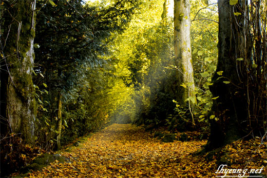
The photo you see above was the result of my feeble attempt at some RAW processing in the digital dark room. RAWs are fairly much the equivalent of those negative black films you used to get with conventional film cameras and had to take to the photo shop to get developed. Most digital compacts can't shoot in this format apart from the expensive high end models which have slightly bigger sensors to justify using it because they can capture more detail.
I turned up the overall saturation in this photo then toned down the green hues and increased the black point so that I could make the trail of autumn leaves stand out. Didn't turn out too bad and should make a nice wallpaper!
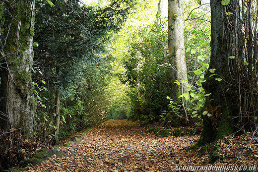
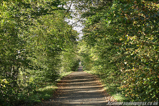
Below is the original photo which I like most of all and came across in a park that I've been to many times already but never came across before. Shows how much of it I've explored!
I used the largest aperture my lens had at f/3.5 and a short shutter time to create as deep a depth of field as I could achieve, blurring out the trail as you go further away.
Lovely trail but only because it was dry... I think it will be very muddy when it's wet!
Without some custom post processing, photos fairly much feel like your run of the mill shot that anyone can shoot if they have the right location but in this case, I chose to keep them as they are since I'm not trying to produce a distinct piece of art for magazines or the like.
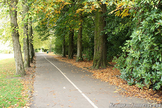
Anyway, went on round to the cycling lane which I thought was a good idea. Was worried the lane would take up too much space in the cropped down banner but it turned out fairly well with the stumps of the trees still visible and the fallen leaves. Not many people were cycling. More people walking their dogs.
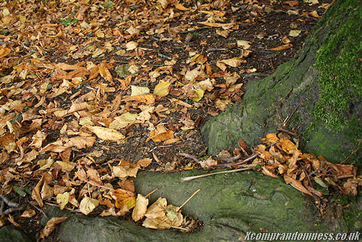
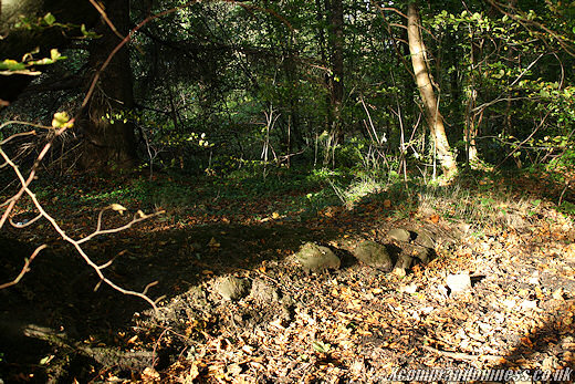
Close up shots of the fallen leaves by the foot of the tree. All that soil and foilage shows up a bit too much when used in the main banner so I didn't use it for that. If only there were some mushrooms around then it might have worked... Or I could have tried some post-processing like above.
Not much autumn scenery here.
Or here. Can even make out the coffee cup that someone left littering around...
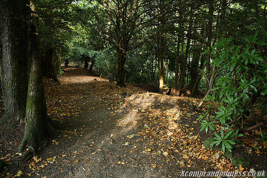
I liked the lighting here just as the sun was beginning to set. Another nice trail.
Again, some good lighting but I think there was too much foilage here. Better have boots on when walking through here after a rainy day!
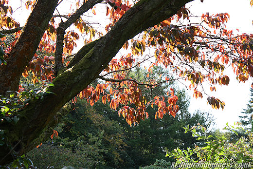
Quite a good mix of autumn colours in the tree here so I used this.
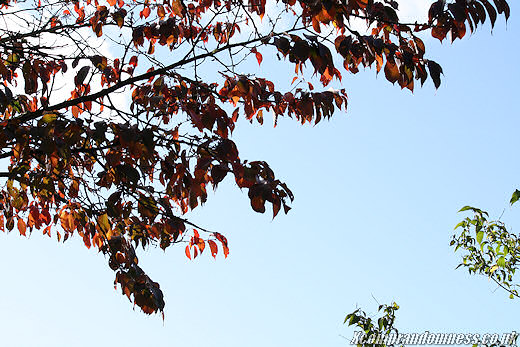
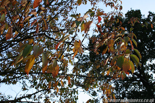
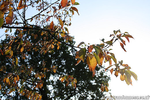
Then come the leave only shots.
Used a large aperture and short exposure time again here to blur out the background. Liked how you can still see small hints of green.
Overexposed deliberately here using a slightly longer shutter time to brighten up the leaves' colour by capturing more of the light shining through them. Worked out great and probably the best shot of autumn leaves here.
That's why I prefer compacts with manual controls.
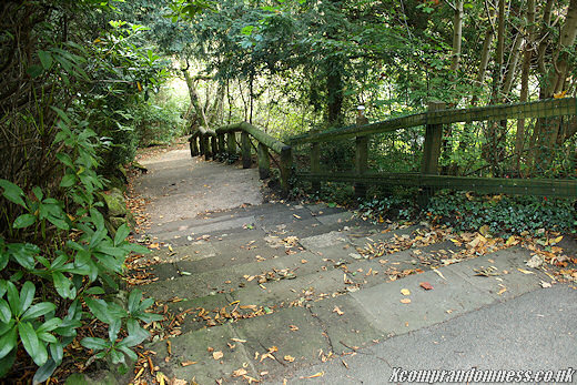
Not the whole trail was covered in leaves or had autumn colours which was why I had to do a fair bit of walking around to find the right spots. I wonder what defines when a tree's leaves change colour because some tend to change very late into the season after all the other trees have gone bare...
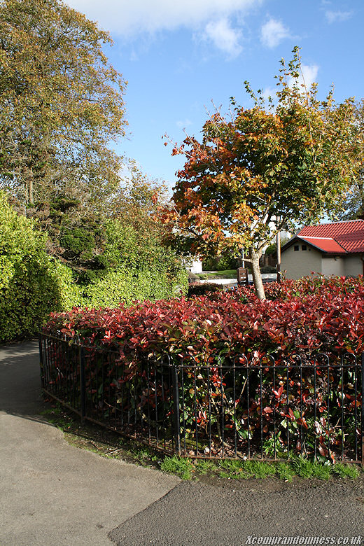
Nice picture but didn't want to have the red roofed building in my banner.
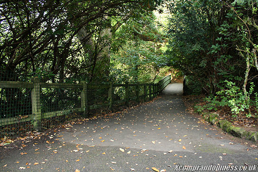
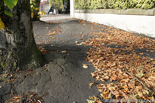
Thought it was a good idea taking a shot of a manmade pavement complete with a roadworks sign in view but, it didn't quite fit in with the other photos that were fairly much nature only. Too much tar.
Didn't think I would end up writing something about banners but, posting these for the record so that I can see if there's any change in my photo techniques as the years go by - Or at least what I tend to shoot.
Also thought it would be a waste not showing the full photos ^^;

Xcomp Author
LastSKYsamurai
I'm too down under, & wish I lived in the UK, oh well. :( - Nice shots! Catcha.
Ashram
Xcomp Author
Ashram
I quite like the processed photo at the top; it makes that beam of light really stand out.