Persona 5 Official Design Works Artbook Review
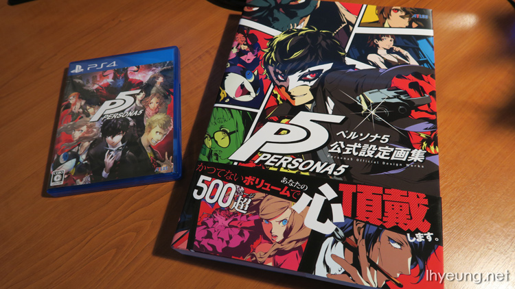
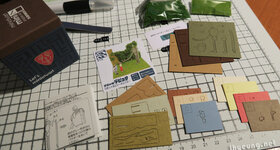
Persona 5 Official Design Works is one big heavy artbook... Probably the biggest I've seen at 512 A4 pages, 1.6kg. It reminds me of the the free telephone directories that are distributed to homes in the UK but, the paper and print quality's much better of course. Shows how much thought went into the game and why it's oozing with quality, enough to play through a second time to platinum it.
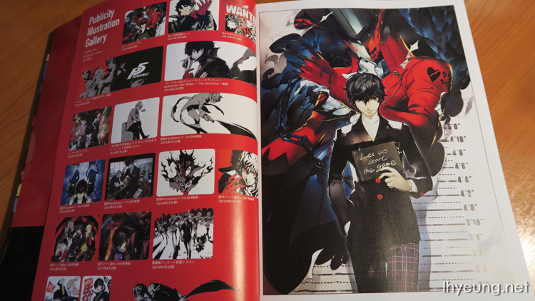
Book kicks off with about 20 or so pages of promotional illustrations...
So before we get to the actual content filled with designer, Shigenori Soejima's work here are the contents. Titles are quite creative...
- Characters Gate, p23 - 241
- Sub-characters Gate, p265 - 339
- Enemies, p354 - 400
- Miscallaneous, p404 - 410
- Persona 5 World Gate, p413
- Interview with Soejima, p506

So, let's go through some of the notes I found interesting...
Characters Gate
This section is probably the biggest part of the book and is filled with profiles of the characters complete with design comments, early concept art, facial expressions, icons, all out attacks etc. Everything character related.
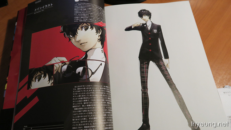
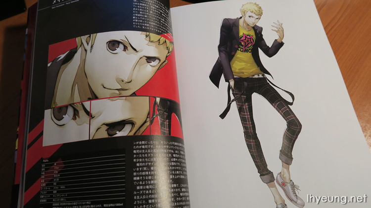
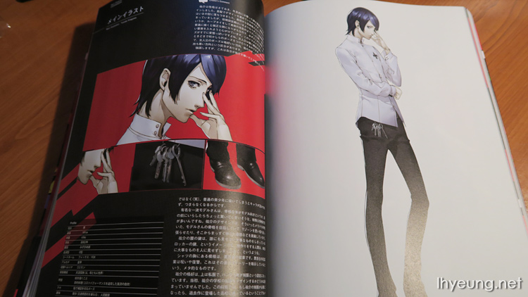
Protagonist
While for Persona 4's protagonist was designed with domestic dogs in mind when he designed the protagonist - someone who is loyal and sincere, Persona 5's protagonist was designed with domestic cats and panthers in mind, lol. Someone sexy with both a public and hidden side which was just right with the whole Phantom Thieves theme. With glasses on, he looks like a kind, tame young man but as soon as they're off, he looks like a completely different person.
The school uniform was designed for the protagonist first before it was tweaked and applied to the other characters. Soejima went for a punk look because if they went for someone too formal, it wouldn't look like they're the kind of people that would turn into phantom thieves and fight against society.
Coincidentally, the designers originally considered having them act as phantom thieves with just their school uniforms but, they decided against this because they would seem more like rebels. Instead, they decided to go with the well known phantom image from movies instead.
The female staff thought it was cool and stylish for a young man to carry a bag around just like the way air plane pilots do and that's why the protagonist was given a bag - which we see him carrying Mona around of course.
As for his weapon, a dagger seemed the natural choice as he can throw it at his enemies when making a getaway.
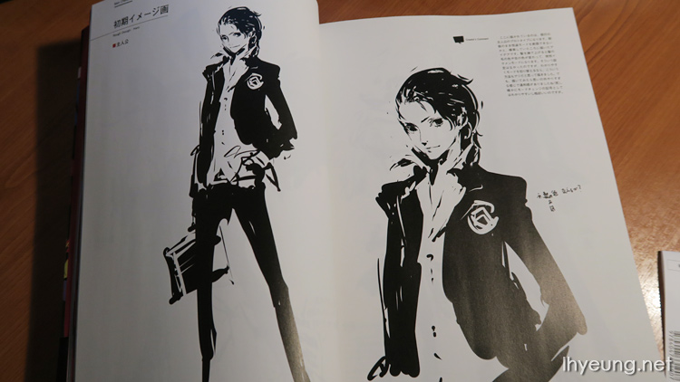
Early designs of the protagonist.
This design was used during the pilot stages of the game when the team was still considering the gang just went about as phantom thieves in their school uniform. He looked different if his hair was all slicked back with his hair and eye colour changed - easy to know when he was switching between his two different sides but, as Soejima continued his design, it just didn't feel quite right.
There was also a point where he would be wearing blue gloves to carry a gun around but, they considered it going too overboard and started to feel too Manga-ish/Anime-ish so the idea was scrapped.
Ryuji
Ryuuji was probably the only character design that didn't change much, going straight for a typical mischievous school kid personality with a broken fashion sense. He had the least number of sketches.
His brows are drawn frowning to show how easy he gets ticked off and his back is slouched to show how lazy, unmotivated he is. He is supposed to be the complete opposite of the Protagonist's gentleman figure.
His Persona, Captain Kidd he was given a ship to ride by Hashino's request to match his phantom thief biker jacket. The face you see on the ship is probably what Ryuji would have decorated it with if he drew it himself, lol. They thought it would be great once his Persona evolved to match the cloud the naughty Goku from Journey to The West rides.
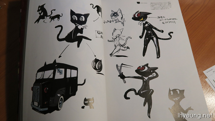
Morgana
Soejima was pretty passionate at first coming up with 100 pages to go in the book but, obviously that would have been too much. Morgana was designed with the idea of a "cat partner" in mind and goes with Soejima's personal rule of designing mascots - using "toy colours" set of red, yellow and blue. Even with Persona 3's Aegis and Persona 4's Kuma (Teddy) the same colour palette was used. If you're wondering where the colour red can be found on Morgana, have look at the inside of his mouth.
Perman (created by Fujio who is well-known for his Doraemon show) is a favourite show of Soejima's so Morgana was designed with the same mask. Great care was taken in drawing him so that he wasn't overly cute so that he has more personality such as giving him slightly angled, slanted eyes.
Morgana maybe small but he has a big personality and not only that, if you've played the game you know he is actually a very important entity. Soejima wanted to show this by making Morgana's Persona Zoro big in contrast. Zoro is made to look like a balloon as if that personality is coming out of Morgana but because Morgana constantly wonders who he is in the game, the team decided to make Zoro incomplete by not giving him proper arms.
The original Zoro design looked like a hairy bandit before it was refined to the final form in the game.
Early designs of Morgana on the other hand was done with the image of a female in mind, giving him a smooth rubber body. He was also supposed be able to transform into anything, not just a van. Originally Soejima wanted the gang to drive around in a open roof sports car but it wasn't going to big enough for the whole party so, mini van it was.
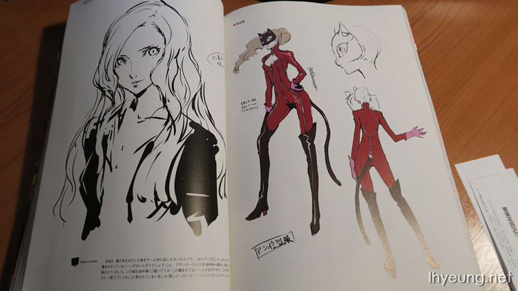
Anne
Anne was one of the characters to appear in early marketing material for the game and was given red tights to match the black and red colour theme of the game. It also helped show she had character because it stood out together with her mini skirt and not many ladies are comfortable with that but Anne doesn't care. She was also given a hoodie that was designed with cheerleaders from overseas school dramas in mind.
You probably guessed from her phantom thief code name "Panther" that Anne's mask is that of a panther. Soejima decided to go with a stereotyped sexy but at the same time cool look for her. Care was taken not to make the design erotic. Anne's image colour is pink so you'll notice she actually has pink gloves on and care was taken to make them blend in with the rest of her outfit without making them standout oddly like rubber gloves.
Her Persona Carmen was designed to look like the boss lady who ran a cigar factory.
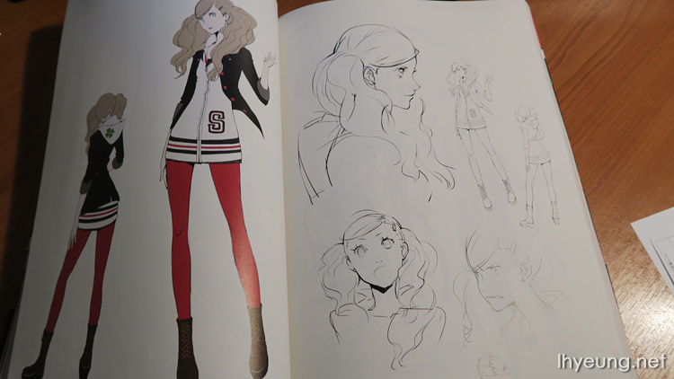
Both Soejima and Game Planner Tanaka Yuuichi really wanted Anne to appear in the game with her hair down - only makes sense when her hair is tied up. Soejima drew this for Tanaka but it wasn't what Tanaka wanted so it never made it in, lol.
Some more early designs of Anne along with her Persona.
Yuusuke
It was decided from the very start Yuusuke would be an artist but early designs of him were more... artisty looking such as having a bolo tie. Since Soejima has always been thinking about cool poses for the protagonist, he decided to give Yuusuke a different kind of pose - give him a pretty, refined face, a model's body frame but a pose that makes him look a bit like a weirdo. This might make people think Soejima must really hate Yuusuke but he actually didn't want him to fall in the generic "pretty boy" image that's so common in Japanese works.
The keys you see are for lockers since he should always be making something as an artist but shows his work to those important to him. You'll also notice a black lily symbol on his shirt which symbolises revenge and hints at how the story picks up in the game.
Here you can see one of those early designs of Yuusuke being art teacher before it evolved into the final game version.
For his phantom thief design, it was decided he'd specialise in Japanese art so he was given a Kitsune (Fox) mask and a tail was added in to go with it. His sleeves were made bigger too to go with the design that traditional Japanese clothing has.
Yuusuke's Persona Goemon also goes with the traditional Japanese theme which in this case is "Kabuki" stage play. The roman symbols you see on his sleeve adds to the idea of tradition and, the number "5" pronounced "go" goes with and is part of the Persona's name.
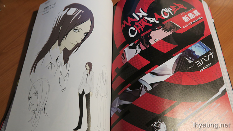
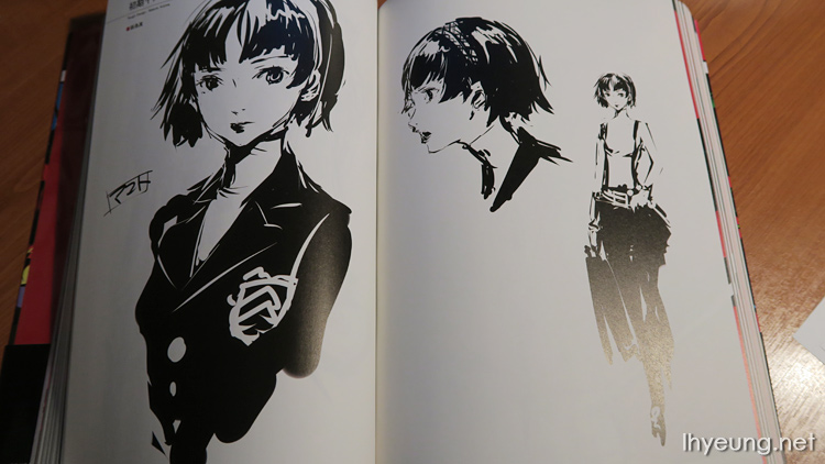
Makoto
Makoto wears the school "uniform" but she's wearing a waistcoat a tartan skirt so not really what you'd call a uniform. Various sketches were done to try out different kind of personalities for her but as soon as it was settled, not many more were done for her final design so this is all there is in the book.
When Makoto first appears, she was very much up against the rest of gang. As the student president her appearance was given a serious, sensitive and tough look. She was given dark eyes, a black eyeliner and her eyebrows are much lower to show this.
However, unlike Mitsuru from Persona 3 who gave you the feeling she'd loosen up a bit, Makoto is designed to look like she won't at all. She looks so uptight that you just can't tell what would happen if she snapped. She was actually a really nice girl who enjoyed her freedom but with all the expectations on her as she grew older, her freedom became restricted. If she wasn't restricted she would probably be a much snappier person.
In Phantom Thief mode, she uses fists to fight to symbolise her snappy nature and wears an iron mask to signify she's always on her guard about her true self. Her suit makes her figure a bit too restrictive so a scarf was added in for more dynamic poses. During her early designs, she had revolvers with balances on them that symbolise justice.
For the final "fortress" design it looks like she's a Bajiquan martial arts expert which you wouldn't expect from a high school student but, there was a point where she was supposed to be a character who was well educated and active.
Oh, and she does not see the need to answer any questions regarding her weight, lol.
Her Persona, Johanna took the form of a bike because Hashino suggested it - both her character and the game's theme revolved around freedom, speed and haste so it seemed to suit her.
Some people have asked whether the curve of the seat on Johanna's back was to symbolise her gender but, we actually positioned the keyhold by the seat to do that. We also wondered whether she should have a face but we have a design rule that all Personas should have a face. Otherwise you wouldn't know if something was a Persona or not.
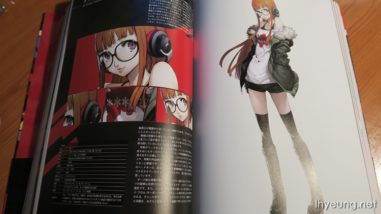
Futaba
Futaba originally had black hair but Soejima suggested they made it orange because black hair on a withdrawn individual gave too much of a negative image. Giving her orange hair has the same effect as Anne's red tights showing she does what she wants even though not everyone around her can understand her. It's like someone wearing lots of piercings - they enjoy wearing them and being different, not to appeal to others.
The dyed orange hair also makes her feel incomprehensible - someone who would just dye her hair on a whim and no one would know why. This kind of image also makes her stand out from others.
Since she's always looking at a computer screen, she'd probably have bad eye sight. Big glasses were chosen to show this and also add to that withdrawn personality as it hides more of her face.
Someone who loves electronics conveys geekiness the best so headphones were added in collaboration with Soejima's favourite AKG brand - if she's a technology geek then she must be quite the audiophile too. Unfortunately, she'd have to remove these headphones when going out so, the big glasses are also there to help make up the geekiness when that happens.
And the geekiness can't stop there.
Her t-shirt shows asterisks like the ones you see when entering passwords and, her parka jacket has "AFK" on the back which as everyone will probably know, means Away From Keyboard. Futaba seems like the kind of person who'd buy odd items through the internet, no?
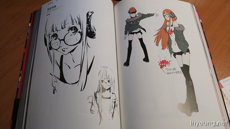
None of her designs leave the word "geek". Even early concept art show that she can't go out anywhere without her electronics. Her fashion doesn't change much when going out either since she wears similar clothes to when she's indoors.
Her Phantom Thief design was based on a high tech looking design like that from the movie Tron.
Amongst the early concept art for Anne's designs, you saw her wearing night vision goggles but it just didn't feel right. On the other hand, it works for Futaba. In the Persona series, the navi characters always have their eyes covered because theyr'e actually watching over their friends and guiding them. Futaba's goggles are made extra large so that they resemble big cute frog eyes.
You might notice the green lines that run down her harness down to her belt. As a high tech spy, it would help her lower to pull herself up somewhere using a wire. Not that she's the outdoor type to pull off such stunts...
Her Persona, Necronomicon should actually be in the form of a grimoire but it's not something Futaba believes in. She has a bit of "chuuni-byou" (think Okabe from Steins;gate) and believes in UFOs such as one actually crash landed in Nevada so it made sense to give it the form of a UFO instead. Chuunis believe the world around them is all a lie and only they know what's really happening behind the scenes which will one day lead themselves to salvation.
Following the design rule that Personas should all have a face, a gargoyle can be see on the top. Once again, the patterns you see on it was added to match the image of a high tech geek such as Nazka Lines, DNA patterns - basically Futaba's idea of what the "real world" is really about although some of the symbols were added just for one.
If you have an image of the Persona notice there's a smartphone symbol on it, lol...
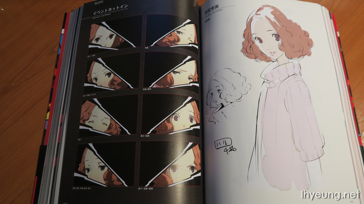
Haru
Haru went through many phases in life and there was even a time when she was quite tomboy-ish which is why she was the last person to join the party. Soejima wasn't quite sure what kind of person the last party member should have been like so that the personalities balanced out but, the word "gentleness" came to mind.
She was designed with an approachable, kind image in mind. Kind of like Fuuka from Persona 3 but with Fuuka's design, the character also had to look fragile and weak. Haru on the other hand, had to show she also had a strong heart so she shouldn't look as pessimistic so her clothing was designed with all that in mind.
Her Phantom outfit goes with the three musketeers design. The staff was a bit hesitant since the musketeers symbolised justice and wondered whether it would balance out with the others or, would it end up being the odd one out.
There was a lot of trial and error to figure out how to make her blend in with the rest of the party. Eventually it was decided to give her some heavy weapon such as an axe or even a grenade launcher at one point! A big contrast to her gentle image and it also meant she is the most heavily armed in the party.
At one point Haru was designed to look like a classic Japanese dancer so the mask she wore was a Noh mask but, it made her look too old fashioned. It was going to be a Noh mask with the face of a fox but, drawing it was too difficult and time consuming such as whenever parts of the mask got broken and some of her face was revealed so, the idea was scrapped.
Haru's Persona is "Milady" which goes with her musketeer outfit and is also something that Japanese people are familiar with. Her design was done so that on the surface she looks elegant and gentle but in reality, she is very good at getting close to others as part of her schemes. Originally, the designers wanted to hide all sort of weapons on her (as some of the sketches show) but that would have made her like a assassin (like those in China posing as a high society woman apparently). In the end, not many weapons were subtlely added to make her look as if she would challenge someone to a fair fight. Just like the image of many high society gatherings, she is given a mask and only the eyes are shown to show anonymity.
Soejima should have just referred to femme fatales instead of Chinese women assassins. Not like China's the only country that resort to feminine charms to assasinate someone...
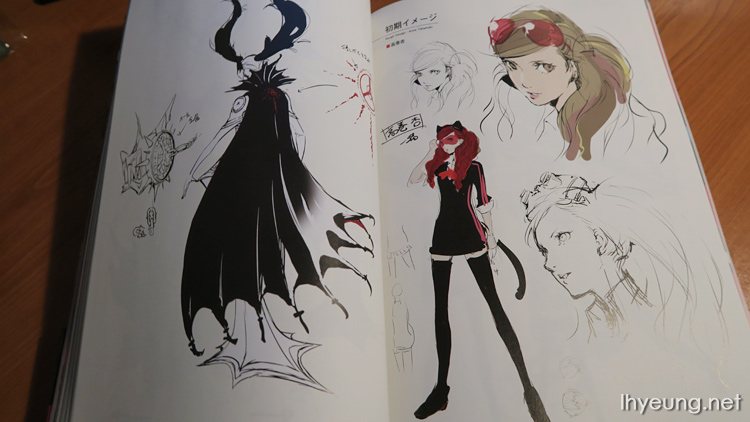
Akechi Goro
It was already decided Akechi's main colour would be white in contrast to the black protagonist. It was also decided he would be a detective but the team wasn't quite sure what kind of role he would play in the story. The team also had to decide how suspicious he was going to look. If they made him to lively looking he would stand out too much.
In the end it was decided it was was best to make him a well-behaved young man but also not to make him look more serious or hard to approach than neccessary. The team went ahead with a cheerful personality, leaving his shirt collar is unbuttoned, tie isn't completely tightened and his hair is a bit on the bushy side. If you looked at someone like Adachi from Persona 4, he didn't seem suspicious because he was approachable and looked like the person that would mess up.
There was a point where someone thought the black gloves would give him away and if you look at the blown-up portrait, his smile really isn't that sincere. The team also tried to go with a really charismatic character design but it felt too obvious that he would end up betraying the characters or end up dying.
He could also have been Makoto's older brother too.
The mask he wears is one that plague doctors from the medieval times and the long nose resembles a Tengu as if he looks down on people. Not the kind of person you'd approach. In contrast you see he is wearing a formal suit that officers who kept order would have worn.
His Persona Loki's first form looks like a hero of justice, the kind of super hero image Akechi has. Just like how Akechi has a logo on his brief case for self-recognition, it also has its own "Robin Hood" logo on its arm.
For the second form the dazzle camouflage pattern on it which was used by war ships during WWI to make it hard for the enemy to determine their size or shape. It also feature horns similar to that of the leucochloridium parasites to make it feel disgusting and to make its origin less clear. This way it made both Akechi and the Persona's true self more of a mystery. Some thought was also put into the sword where the blade was re-designed so that Loki could hold it despite how hot the sword is.
Confidants / Sub Characters
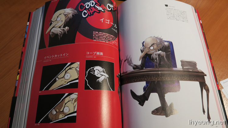
And we have the sub-character section featuring Igor who was originally designed by Kazuma Kaneko. He was carefully re-drawn to appear in this series so that he kept his appearance from the rest of the series.
Sojiro Sakura
Aethetics is an important part of Persona 5's design theme so Sojiro was designed so that he would still seem full of life and not completely out-of-trend despite his rough temper. The team also wanted to make it as if the protagonist picked up his fashion style from Sojiro as they lived together - a grown up man with an elegant style who's also a bit of a playboy. He is quite old so his hair was dyed black to make him look a bit more youthful.
Chihaya Mifune
Chihaya was designed to kind of look like a figurine prize and as close to a fortune teller that Soejima had in mind. By making her look like a figurine she would look cute, mysterious and kind of detached from the modern day world. Every time she was drawn they would pay attention to her make-up and make it really obvious there were some on her cheek.
Caroline and Justine
Tanaka had always wanted to have twins in the Persona series so they finally went ahead with it this time. They were designed to have a mysterious air about them and, they each wear hats with a mix of letters from the word "oxymoron". Personality wise, one is supposed to represent the left brain that handles all the logic and the other the right that acts on intuition.
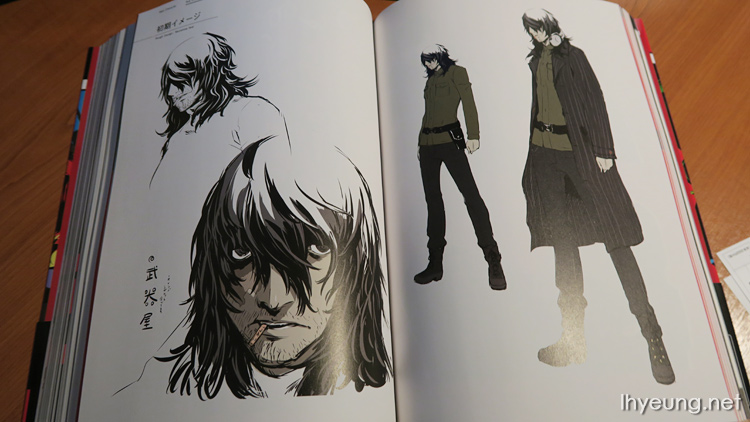
Munehisa Iwai
Munehisa wasn't always such as a rough looking character but since he's retired from his prime days, that's the impression Soejima wanted to give players. He only sells model guns but he wears earmuffs used in shooting ranges so it kind of gives away what business he was in before. You'll also notice him holding a lollipop because he might have been acting cool once thinking, "Who cares if smoking's going to ruin my health? YOLO!" but now he's just tired and feeling defeated. The overall image was to make him look like someone who has given up on everything but when the MC comes along the energy in him is rekindled.
Tae Takemi
Someone who doesn't hide her peculiar hobbies and lives true to herself. She is a bit like Anne and Futaba. However, because of that it's quite easy for those around her to start avoiding her. She was designed wearing punk fashion so that she doesn't look like the profession she is in and perhaps does exactly what she is supposed to do. Her office was originally decorated with equipment that would have given you the impression she might have been a mad scientist and think, "What on earth is she researching in here...?"
The original idea was Tae wanted to bust the pharmacy she worked for the crimes they were committing so she was also given a femme fatale look with eyes that give off a killer's intent. The bullet-shaped pendant she carries around contains the proof she needed. However, Director Hashino wanted all the girls to look cute so that look has been dampened down in the final design.
Sadayo Kawakami
She isn't blessed with a great life but it isn't that bad either. Her overall image was just to be "normal". The team just wanted to depict a woman in her thirties leading your average life so they took care not to make her stand out such as looking cool or fashionable. Her cheap looking clothing makes it look as if she isn't the type who would cosplay. Her appearance and relaxed look actually gives her the look an intelligent woman.
Ichiko Oya
Someone from the press that doesn't give off much of a presence when she's on the scene. Ichiko was supposed to be an journalist but the team was unsure what kind of journalist she would be... Someone that would run around with a camera man or someone who would just write articles. Just like early designs for Tae, Director Hashino complained Ichiko's initial designs weren't cute enough and demanded Soejiro drew her without her big nostrils showing which lead to the final design you see now, lol.
Shinya Oda
Originally he was going to an energetic looking boy but that didn't quite fit the image of his gloomy side so, the team focused on his outer appearance. Grade school boys dress up quite cool these days so they decided to give him a slender body to go with that image, so slender he wouldn't be someone that would wear the traditional ransel backpack. The team thought a red cap was a necessity for gamers.
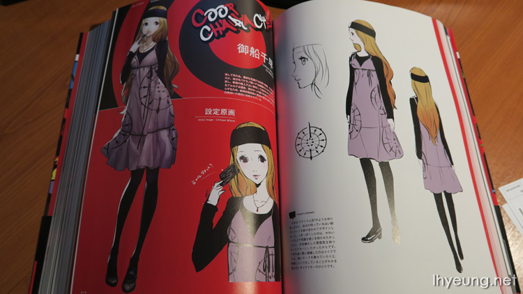
Hifumi Togo
Hifumi started off as a character that was supposed be a supporting character - if Makoto was finalised as the Phantom Thief team advisor, Hifumi was going to be made their tacticianist. Makoto ends up assuming both roles but her character wasn't forgotten when the team was thinking about what confidant characters they wanted so, she ends up appearing as a confidant in the game instead. Designed with a straight forward alluring Japanese beauty in mind, her interest in Shogi was already determined in her initial design. To add to her Japanese fashion style, they added hair accessories that would fit the same image and drew her so that she had the air of a smart, intelligent person.
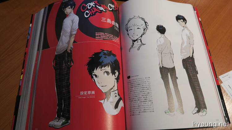
Yuki Mishima
As one of the supporting characters care was taken so that he didn't have too much of a personality and looked more like your general character. Part of his role is to make the player feel satisfying playing the role of a Phantom Thief. To do this, his character should be equally excited about the gang's activities and share the excitement when they're praised. He kind of represents the general public offering support and cheer which is all the more reason why he wasn't allowed some personality. Otherwise it would have felt like he's just a weirdo supporting of the Phantom Thieves.
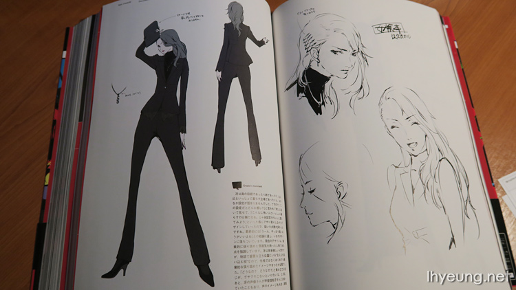
Sae Niijima
The team initially wasn't quite sure what kind of character they were going to make her. Ideas included making her Makoto's mother, her sister or even living together with the protagonist. They tried the last idea and thought, "Hmmm, I wouldn't want to be living with a scary person like her," so a variety of other ideas were tossed about. Eventually, the team settled on a young woman look and someone who made her career a priority.
Although she's actually a nice person she plays the important role of interrogating and cornering the protagonist so it was all the more important she put her career first in her life. Her Japanese voice actress Yuko Kaida was also selected just to boost this image.
As for the Shadow version of her, she was designed to look more mature but also someone who would resort to any means to win. She was made to look like a gambler to match her Casino Palace and the dog tattoo on her back is supposed to symbolise sin while the flower tattoo on her arm represents jealousy.
One-eyed Sae?
Enemies
All the bosses of the game are listed in here such as the first boss, Kamoshita, a teacher rumoured to sexually abuse his students.
Miscallaneous
And the rest of the NPCs.
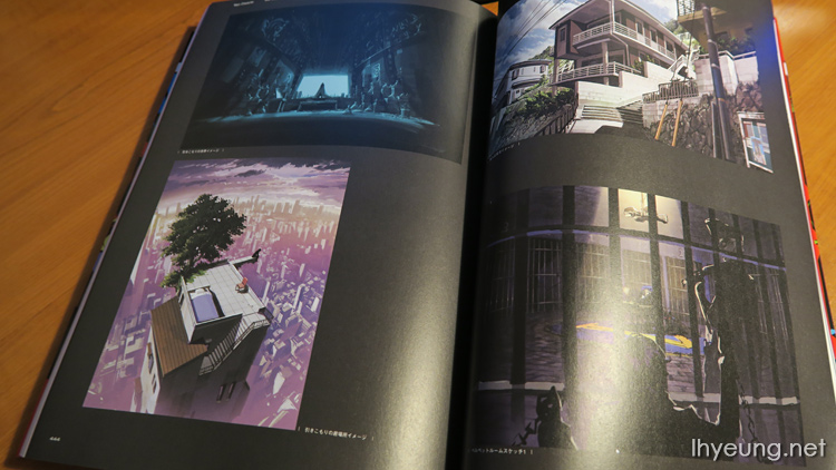
Persona 5 World Gate
All the locations around Tokyo you can visit and having visited Japan myself, I must say they're really well done and almost exactly mirrors the real locations like a lot of Japanese fiction.
From places like the famous Takeshita, Harajuku...
Sensoji Temple, Odaiba (where the 1:1 Gundam is), to the chain department stores like Sofmap, Yodobashi.
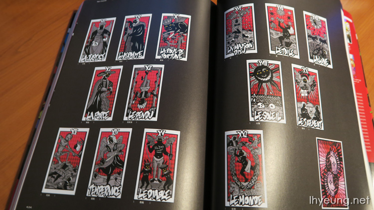
And of course, the tarot cards all Persona games feature.
The various icons and silhouettes that appear during the loading screens when you move locations - which was another feature that made the game really cool. I think it would have been great if they put the rest of the gang in too when you play New Game+ instead of just Ryuji and Anne.

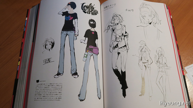
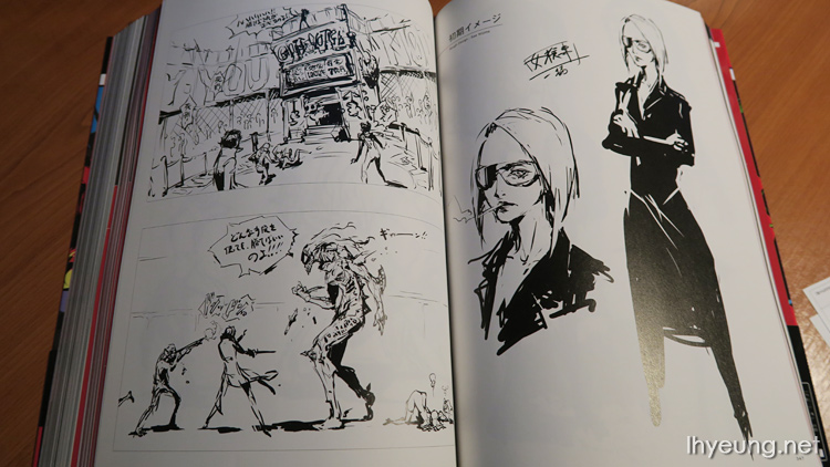
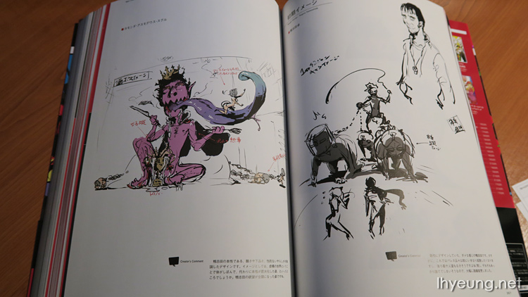
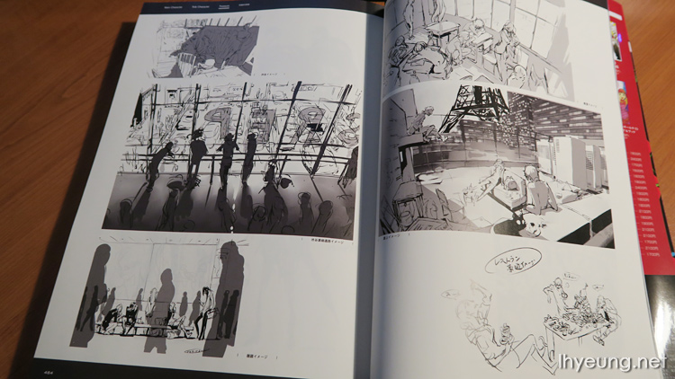
Some awesome full colour concept art.
Followed by lots of rough sketches such as how their school uniforms could have transformed into Phantom Thief outfits or early character creations that could have been confidants.
Looks like there might have been a sofa on the school roof too!
We finish off with an interview with the man himself from November 11th 2016 - Shigenori Soejima who works as a character designer for Atlus but who was also the art director for Persona 4.
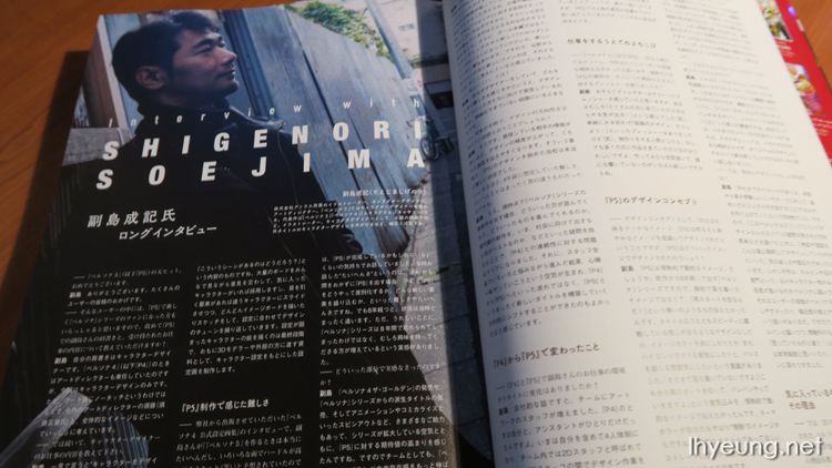
What does a character designer do exactly?
I come up with the design and imagery, deciding the kind of characters that should appear in the game. These ideas are then passed along to various people, exchanging opinions until the team is satisfied they should be used. These sketches and ideas are then passed onto another team who creates the 3D models etc.
When we interviewed you in the Persona 4 Design Works, you had predicted it will be very difficult to create Persona 5 with various hurdles to overcome. How was the actual production process for you?
Well, that interview was 8 years ago and I said that because I assumed we would make Persona 5 in 2,3 years time. What I meant was is if we really did make another Persona game in such a short period of time I would be separate the P4 and P5 or what kind of new features could we add in to make P5 different?
But now that it's been 8 years, it's a complete different story. I appreciate how the Persona series hasn't been forgotten during that time and on the contrary I have a much stronger feeling of how there are now a lot more fans.
Why do you feel that way?
After Persona 4 Golden we had an Anime show, comics and various spin-off titles which really helped boost the expectations for P5. Because of that it made the team feel like we really need to push the Persona brand and aim for something bigger.
However, we were also wondering how people would feel playing a Persona game after 8 years.
What do you mean by that?
We were thinking people who will play Persona 5 will be those who played P4. However, since it been such a long time since P4 we weren't sure what kind of expectations they had for a new Persona game. What made it more difficult was that we now had a new fans that were exposed to the series via various different media types so we weren't quite sure which base to focus on.
Why is that difficult?
As a designer, I need a clear idea of who our designs should appeal to.
And that makes it hard to decide on the direction of your designs?
Indeed. The more information we have, the more detailed and intricate our designs become which in turn makes it easier to convey ideas to poeple. And that was why it was tough during the early stages of making Persona 5.
I see, so that's why it's difficult in a completely different sense than what you expected 8 years ago.
Yes. We wondered how the new fan base would enjoy and what would make them happy in the latest title. There were various questions in mind we had to clear up first such as whether it will have any link to P4 and also what was in the company's best interest. After puzzling over various issues the team decided to turn a new page so that we weren't just progressing from P4 but creating a fresh new title that was P5 and I'm glad it turned out that way.
Did your style change working on P5 compared to when you worked on P4?
Our art team was bigger. When I worked on P4 I only had one assistant. For P5 it was me and 3 other members on the 2D art team. We would work on our designs and discuss issues such as "What should we do about their clothing?" and say, it should be more like this or not like that etc. I did the majority of the designs while more effort was put into the more finer details by the other staff. Everyone did a lot of illustrations so there was a lot of variety.
And what changed for you personally?
I worked on less art than I did on P4. It might seem like a very minor change but in P5 I made the brows on the characters lower so that they're closer to their eyes. This way, it really adds shine to their eyes.
Both P3 and P4 were major hits. Did you feel any pressure from expectations?
I think the director was under that kind of pressure. For me, it was more like "It's really motivating when I know there's going to be lots of people seeing my work!" (Laughs) I did have other kind of stressful moments such as "What are we going to do about the uniform?" (Laughs) I'm sure anyone who produces some kind of work will always be happy others are enjoying their work. I think it's extremely sad when no one views the work you've put so much effort into.
P3 had a cool image, P4 was bright and full of energy. What was P5 designed with in mind?
P5's probably more about passion. It's been 8 years since the last Persona game got released so we didn't want to go with a calm quiet image. Instead we wanted to convey "We are starting anew!" You can feel that kind of adrenaline from the logo design which is also why we've chosen red and other high contrasting colours to use in the theme. We really wanted to let players know, "We're not done yet, there's a whole more coming!" Red fairly much helps symbolise passion. It gets straight to to the point about how much passion we have for this latest game.
What kind of theme did you go with for the characters?
Characters that had habits. We aimed for a picaresque type of character.
What about the theme used for the phantom thief outfits?
We went with a straight forward classic look. There were all sort of suggestions such as designing the outfits with a classic look in mind then re-arranging their uniforms to see what they'd look like in phantom thief mode. However, I thought it'd be easier to convey the idea of phantom thieves if we went with the classic leather look rather than something modern.
Did you think about what theme to go with for the protogonist's Persona design?
I decided to go for something straight forward, something even more so than the phantom thief outfits. Game director Hashino had a different opinion and wanted it plain straight forward. He requested, "If the Persona's going to be Arsene Lupin then we must keep the silk top hat." We talked over about how if we were going to follow the trend in the series, maybe we should design Arsene in the same way as we did with Izanagi where we create an original design instead of keeping their original image.
And what lead to the current final design?
Up until P4 a lot of Personas were designed with their names in mind with some degree of mystery. We would look at the Persona and think to ourselves, "Why did were the Personas designed this way?" and then found it was fun when you looked up the legends and myths that surrounded them which lead to the form you see them in. However, this time we had chosen well-known characters such as Goemon Ishikawa and Carmen for the rest of the Persona so that players would recognise them right away. This was why we decided to make Arsene Lupin different from what people already had in their minds.
So out of all the characters and Persona, which are your favourite and why?
It must be Arsene because he has some stylish details on him and is very different from the other Persona. I think it's great that the flame on his face and the red colour really says, Persona 5. I think Futaba's Necronomicon would a close runner up.
Why was Necronomicon an original design?
No one knows about Necronomicon. I like the "what can you come up in 5 minutes" design (Laugh). Johanna was also done the same way because not many people know about her either so it was meaningless to stick to a straight forward image. We ended up with an original design for her so that it would give the idea of what having a "Persona" meant.
And your favourite main character?
Anne. As I wrote in the design notes, she was one of the early characters I designed for the game and really said, "Persona 5" so she was more a baseline for the other designs. For example, when I first designed Makoto and showed her to the staff they were thinking, "Is P5 a really serious themed game?" and didn't really get what the game was about. On the other hand, when I showed them the design for Anne the colours and style for her really spoke volumes. There was a lot thought put into Anne since she was the first character I designed for the game.
Your favourite confidant?
I like Sae Nijima. I like to twist my character designs a lot so I get told "Make them cuter!" a lot. I designed Sae with a lot of cool, straight forward style and made her the most balanced beauitful woman.
So Sae is your idea of a beautiful woman's characteristics?
Yes.
When was Makoto's name come up with?
We had various names but a lot of them went out the window (Laughs)
In the P4 Design Works, you said there are always females with hair bands in the games so could tell us about them this time?
I think I had the most fun designing Makoto (Laughs). I've never had to design most of the characters similar to the ones you see in P5 but for Makoto I had sketched about 186 pages. The rest of the staff felt Sae and Makoto were the hardest to draw.
Why's that?
For most characters, they give some kind of strong vibe that shows what kind of character they are such as they're cute or cool but in Makoto and Sae's case they do not have that kind of stance about them. They had to be drawn so that it doesn't look like they themselves think they're beautiful. Seems it was a challenge for everyone apart from me. They said, "I don't know what to focus on" or "Could you do the face please?" so I ended up doing the faces for them (Laughs)
In Makoto's case you didn't give her a hair band did you? Could you tell us more about her?
I myself feel Persona 5 really doesn't need to have character with a hair band (Laughs) But there are people who think otherwise, "There's always a character with a hair band" or, "I love characters with hair bands!". I had mixed feelings with those thoughts in mind. I thought to myself, how can I make myself like characters with hairbands to avoid thinking "Oh no, not another hair band character" (Laughs) That said, I didn't really fuss that much about it when I designed Makoto's hair band.
But Makoto's hairband does look diguised in some way.
Yes... It did turn out that way. When I designed Makoto I realised her hair isn't long enough to use a hair band so when I did some research I found there were hairbands made from synthetic hair. When I design female characters, I like drawing the outline of how a hairband divides their hair. It's... really fun drawing how their front hair, the sides and back are composed and form together.
Why's that?
It's just like drawing the parts that form a robot. Biological entities are basically a single form so they don't really come in parts. That's why I enjoy drawing characters with accessories such as headphones because I can divide them into parts just like any those that wear hairbands. It's much easier to design a character after you've chosen the angle that accessory is set at. That's why I also enjoyed drawing Aegis from P3.
So you like hair bands and headphones.
In a way, I think girls are cute with hair bands. Actually, I gave Anne a huge hair band because she's still so young but, it made her look like a country girl so scrapped it.
It seems aesthetics is a big part of P5 and you've mentioned aesthetics a lot. How does P5 relate to it?
The word "aesthetics" gives off a fairly strong passionate image. I think the words aesthetics and character is interchangeable. So when I say aesthetics what I mean is someone who you think has a unique personality or, someone who influences others in a good way or, someone who inspires people to think "I can't do what he/she does but I'd like to try". In P5, various unique characteristics flow so naturally together that it makes you realise something is wrong and that by breaking that flow, you can change the world. That's why I mention aesthetics a lot when it comes to P5.
When you focus on aesthetics or character as you put it, what do you focus on?
I wrote about this in the design notes but I go for something that really highlights their personalities such as the colour of Anne's tights or the colour of Futaba's hair. They aren't doing it because it's trendy, they do it because they themselves want to. I think it's great when that becomes something iconic for that particular character and shows their different personality. It's very difficult to achieve something like that so not only do we have to pay attention to appearance but also how they act too. Especially when these characters form this mysterious group in the game.
And what would like to say to your readers who bought this book?
This book is filled with the sketches and designs I had after P5 was finished. They include illustrations that I was hesitant about showing to the public too. However, I myself enjoyed seeing this kind of behind the scenes work long ago in magazines and artbooks too which was how this book was created. I hope our readers will have gotten a feeling of how fun it was making the game. I hope you enjoyed this book and thank you for purchasing it!
So there you have it...
Overall a really satisfying book for anyone who really enjoyed the game. It's chalk full of art and even if you can't read Japanese there is little text to read.

Makoto best girl
Trury65
Sg
I just wanted to say thank you for the review as well as a translation of the interview! This certainly helped convince me to buy the Japanese version of the artbook. I was torn between the Japanese version and the soon-to-be released English version that suffered considerable page cuts... But since you translated the interview, I can buy the JP version without worries about not understanding ^^
Ha Thehuy
LHY Author
Spamurai
Oh and I love Anime & Video games, learned a bunch of phrases just from watching Prince of Tennis and Koroku! Think I'll start studying it more seriously though, because I've always wanted to go there & it would be nice to be able to understand the locals using your own knowledge of the language. You're impressive you can speak a bunch of languages, that's really remarkable. You don't even need to wait for game localization you can just order them from its native country. So cool!
LHY Author
Also, I don't know where you're from but there might be custom and handling charges by whoever delivers it to you in your own country. You'll probably want to check if there are customs on books. In the UK, there isn't customs for importing books fortunately.
It's handy knowing Japanese so you can play their games right away but I learned the language because I'm a Japanophile and just like everything about Japan, lol. Used to read and view photos of everything Japan related because I grew up with Japanese programmes and products but not so much now that I've actually been to the country ^^
Spamurai Shampoo
LHY Author
If 54USD is the total price then I think it's a good price. It's actually cheaper than what I paid for, lol... I imported this by buying it from Amazon Japan then through a proxy service so it wasn't cheap. Partly also because it's a heavy book. Luckily there isn't any additional customs charge for importing books in the UK.
Then there are sites like Play Asia or Yes Asia of course but they've been on back order and can sometimes take months to deliver.
Persona Fan
LHY Author
Li
LHY Author