Studio Pablo ACCA: 13 Background Artbook
申し訳ありませんが、この記事は和訳がございません。
I quite enjoyed the ACCA-13 Anime because it was steadily paced like nothing's happening but you had to pay attention to what's going on. That and it has some great theme songs like "Shadow and Truth". It has some great retro looking backgrounds and world setting too.
So here's the background artbook filled with art from Studio Pablo who did the background art for Madhouse's Anime adaptation of the Manga.
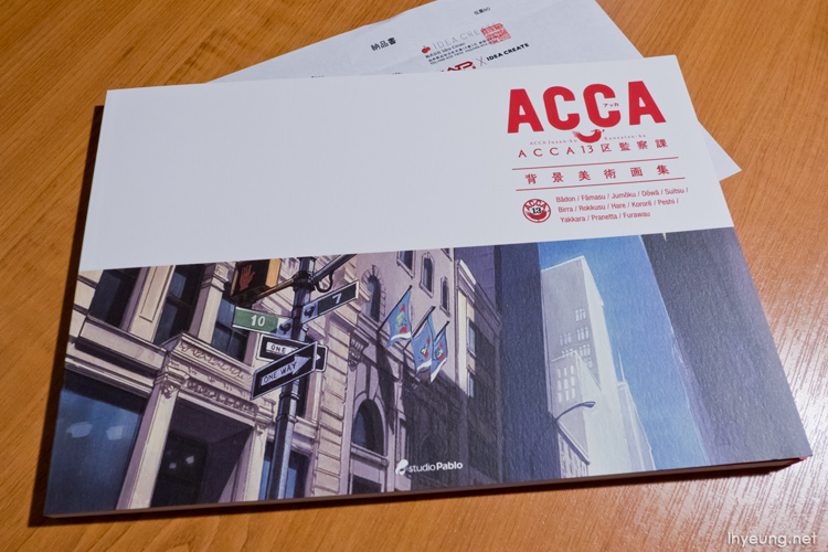
Most of the online Japanese stores including Amazon Japan just don't stock the book any more so I had to buy it direct from Madhouse's online store and use a proxy service to ship it.
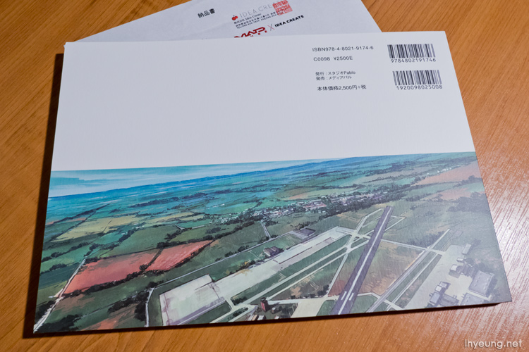
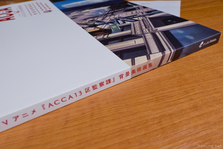
As with the Shinkai's Your Name background artbook, the matte finish paper quality is top notch and it has an extruding logo on it. It kind of makes that part of the book stiff when you flip through it though.
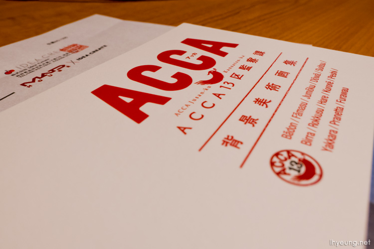
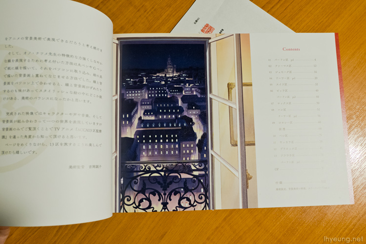
The 112 page, B5 sized artbook is basically split up into the following:
- 13 areas of ACCA, p4 - 96 (92 pages)
- Opening Art, p97 - 101 (4 pages)
- Artwork Production Notes
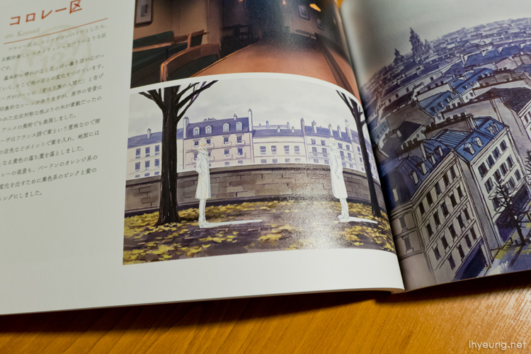
The book runs you through the different areas of the ACCA-13 world setting. Personally, I think there's actually not that many great pieces of art in here even though I was impressed with the art in the Anime.
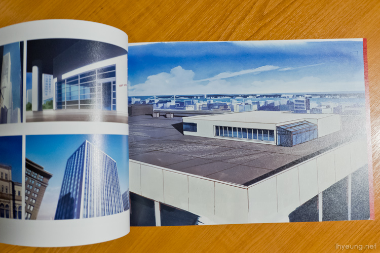
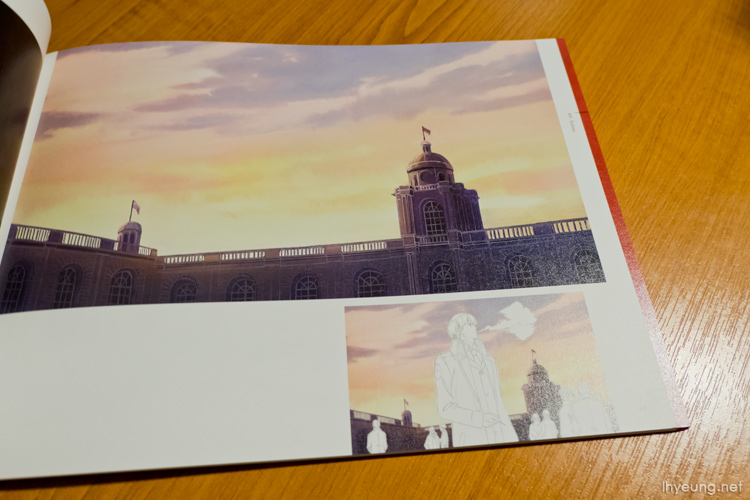
The print quality actually feels a bit off because the larger full page images look blurred as if they were enlarged from small resolutions compared to the smaller images.
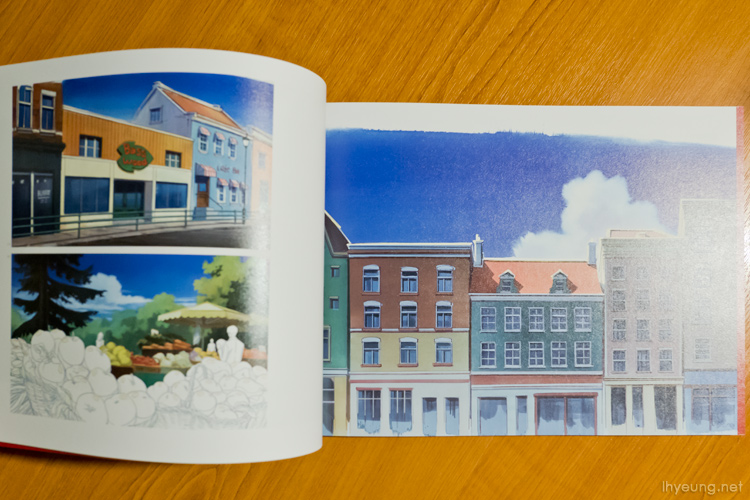
It's not all really all background art because you see some of them with the character and other asset overlays over them. Not many pages of full page art either.
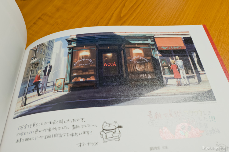
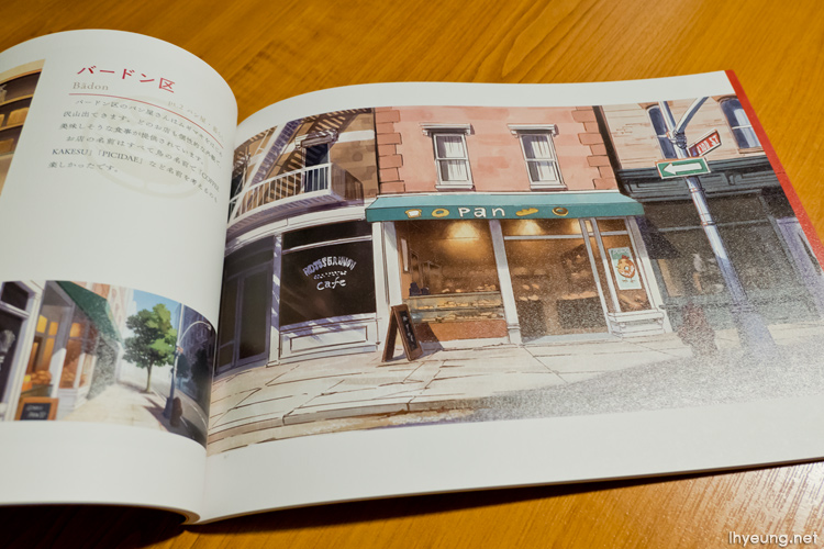
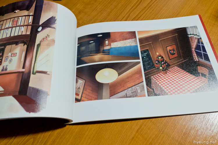
Probably just the bakery and cafe Lotte frequents that stands out for me.
Looks like a very cosy places to visit.
If it's character art you're after, you'll probably want to go for the "visual" art book.
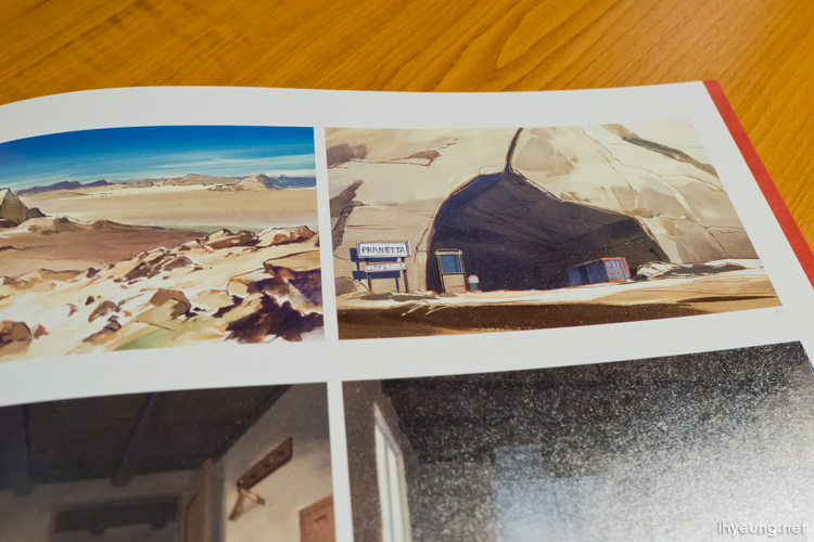
Some of the place names and the Romanised Japanese in the show is pretty funny. It's kind of like pseudo Japanese-English with place names like "Pranetta" here which is probably just the Katakana for "planet". Then you also have a place named "Famasu" which was again probably derived from the Katakana for "farm".
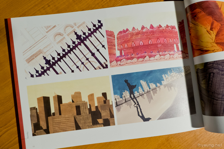
There's a small section near the end dedicated to the opening art. Don't remember the cake being in there!
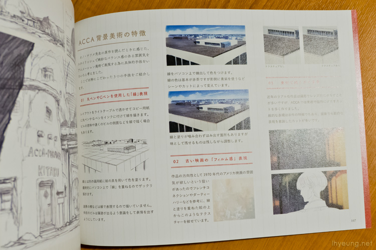
There's also a few pages showing what the art production process was.
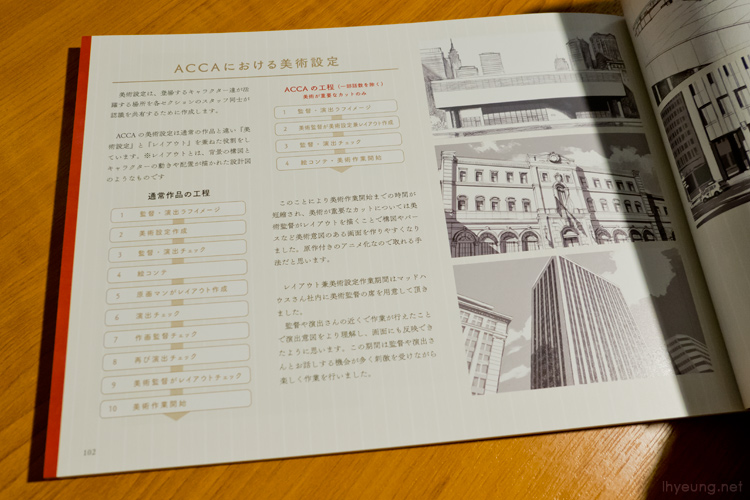
It all starts off with pen and tracing paper, outlining the backgrounds before the colours are added via graphics software.
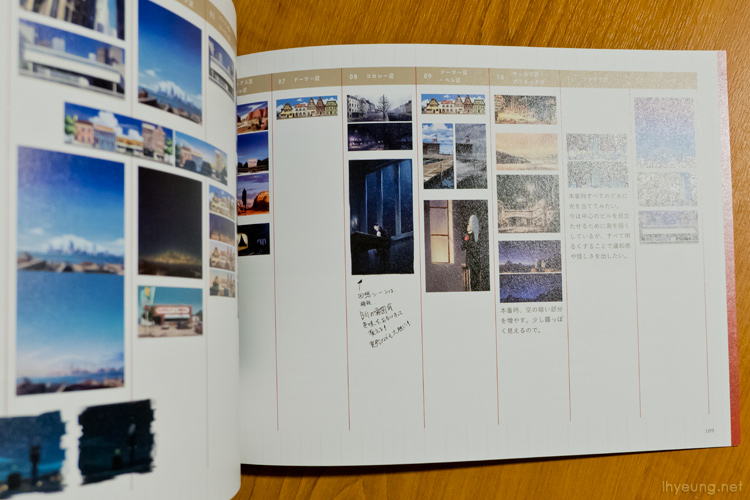
There's also a two page spread showing the time phases of the day they cover for each location.
I guess the other highlight is the bonus image at the back - showing Nino, Jean, Lotte and Rail hanging out.
Not a bad art book overall.
So here's a quick video overview.
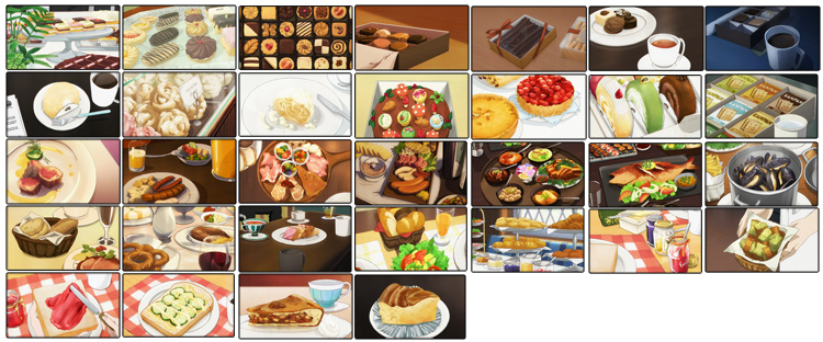
Too bad there's no food art which was something else that stood out in the show but... it's not really background art, is it?
コメント無し