Early Persona 4 Designs
申し訳ありませんが、この記事は和訳がございません。
Don't really link to places for downloading scans or rips but, must thank Dokuganryu for updating his site with the official Persona 4 Design Works artbook. Here's a select few pages that caught my interest - a quick translation of Soejima's commentary followed by my own thoughts.
Don't read on if you don't like spoilers!
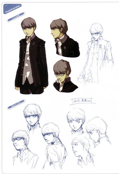
Soejima wasn't allowed to design the MC so that his character is likeable by all. To give him that self-centred impression, he had to be given some odd characteristic. If you look in the book, you'll find a rough child-faced sketch of the MC without it, something he wanted to try out and showed the staff.
Well, I'll just say it again... The MC definitely has that cocky personality about him.
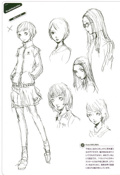
Chie is a girl who is concerned about dressing up nicely so that people like her so, the colour of her hair isn't what she was born with but, it's dyed as part of her character design. All P4 characters are designed with a realistic feeling about them so they have hair colours that can be seen in real life.
These early designs of Chie are either overly sexy or cute... If Soejima chose one of those, I doubt Chie would have had to worry about not being liked.
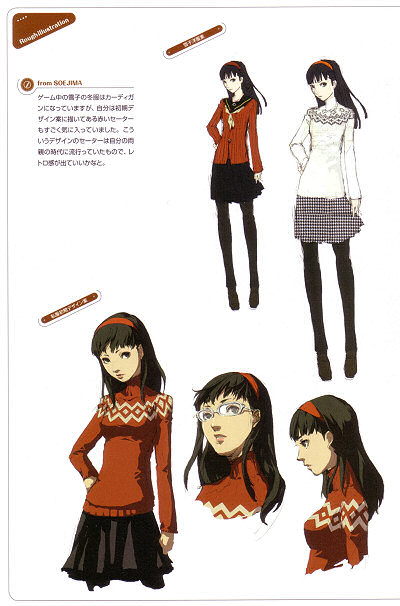
In the game, Yukiko wears a cardigan but originally, Soejima designed her wearing a red sweater which he really liked. It was a sweater that was really fashionable during his parent's youth and he thought he could use that to bring out a retro feeling.
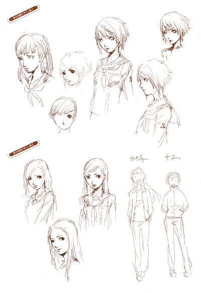
Neither of the early designs give her the sense of elegancy she has in the game. Her eyes give her away. Short hair Yukiko looks cute but her eyes make her look wild. Second design, her eyes look too innocent.
Nice sketch of the two good friends together.
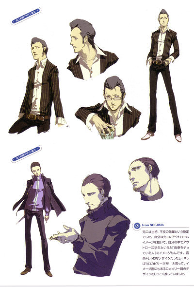
Kanji was designed to be a bad Senpai. Soejima imagined him as an outlaw student that should be into music. The idea of mixing music and retro designs together reminded Soejima of Rockabilly which he has kept throughout Kanji's designs.
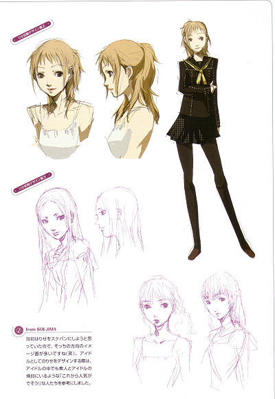
For Rise, Soejima originally wanted to make her a gangster leader but, that idea's overused. He then decided to make her an idol and design her so that her character gives people the impression she has the potential to become popular.
The final design certainly has that feeling to it but, I think I like design number two. Doesn't work with the dark uniform though, does it? And the looks mean she doesn't have to try as hard to be a successful idol.
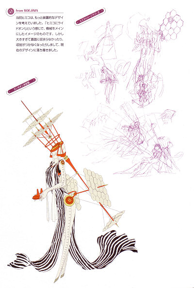
Her Persona "Himiko" also went through some changes, originally going for a very mechanical look but because it didn't fit into the screen, the current design is used.
I like the current design much better. Much more elegant.
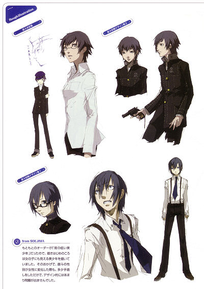
Orders were to design Naoto as a short bishounen and that was what Soejima aimed for - a handsome young man that you could mistaken to be a girl. For that reason, it wasn't difficult to change his gender to a girl.
Sounds like they weren't planning to make him a girl... See how shocked he looks at the bottom when he found out?
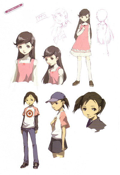
For Nanako, Soejima wanted to add in Junes and give her a cap but, that made her look like the indepedent type who wouldn't go home. Long hair was too cute, giving her an over-protected princess image and so, taking into account both of those factors, the current design was decided.
Hina_shy_Girl
Hellow
Ee
Hikage
Meganeshounen
Longhaired Chie reminds me of Maya from P2:Tsumi and Batsu. Though, her fighting style seems to be of that of her best friend's...
Kanji's first and second designs almost scream out "give me a guitar based weapon!" to me.... lol
His hair now is a lot better than a pompadour or a straight cut though.
Yukiko's sweater already fits her image now, so props to the designers for sticking to it.
Rise looks pretty cute in her early designs... wow. Well, not that she's not cute now, but still... somehow reminds me of Lisa Silverman?
Naoto definitely looks like a feminized MC of P4. Not much changing through the process too.
Xcomp 作者
Yes, Soejima's early designs. The "child-faced" innocent looking design of the MC is in the first image, in the bottom-right corner. You can get a bigger version over at Dokuganryu's site.
Draak
Silver moon arisato
Silver moon arisato
Maaya